Ensemble Screen Structure
Ensemble apps are built using a collection of screens, along with reusable components like widgets, scripts, assets, etc. This guide explores the core structure of an Ensemble screen and the elements that make it up.
Key Components of Screen: This section serves as a reference point for the key elements you'll encounter while creating a screen on Ensemble:
- View: The fundamental building block for screen content and layout.
- ViewGroup: A container for managing and arranging multiple views.
- Header: Optional element for displaying titles, navigation, or controls at the top of the screen.
- Menu: Optional element for user navigation within the app.
- Body: Main content area of a screen, typically containing widgets.
- API: The collection of functions and tools provided by Ensemble for building your app.
- Global: Elements or functionalities accessible across all screens in your app.
Below is the overview of the basic components being arranged on the screen.
View Group
The ViewGroup widget allows you to group multiple Views together and organize them behind a menu, such as a Drawer, EndDrawer, BottomNavBar, SideBar, or EndSidebar. This provides a convenient way to create structured layouts and navigation within your application.
Example
Let's look at an example with a Bottom Navigation Bar menu type.
ViewGroup:
  BottomNavBar:
    styles:
      backgroundColor: white
    items:
      - icon: search
        label: Search
        page: Home
      - icon: assignment
        label: Appointments
        page: MyAppointments
      - icon: list
        label: My Doctors
        page: MyDoctors
      - icon: account_circle
        label: Profile
        page: Profile
Output
To get hands-on experience with View Group, check the live example on Ensemble Studio (opens in a new tab)
View
The View widget defines the overall structure of a page, including properties like header, body and more, to create a cohesive layout and presentation within your application. View requires only body while other components like header and menu are optional.
Properties
| Property | Type | Description |
|---|---|---|
| header | object | details |
| body | object | details |
| onLoad | action | Execute an Action from a set of pre-defined set of actions when the screen loads |
| onPause | action | Execute an Action when this screen is no longer active. This happens when another screen navigates on top of this screen, or when the App (Native only) is no longer in the foreground. |
| onResume | action | Execute an Action when this screen becomes active again from the inactive state. This happens when navigating back from another screen, or when the App (Native only) is brought back to the foreground. |
| options | string | Specify if this is a regular (default) or modal screen. |
| styles | object | see properties |
View.styles
| Property | Type | Description |
|---|---|---|
| backgroundColor | Color | Background color for the screen starting with '0xFF' for full opacity e.g 0xFFCCCCCC. It can be specified as a number, a predefined color name, or a hexadecimal value starting with '0x'. transparent black blue white red grey teal amber pink purple yellow green brown cyan indigo lime orange |
| backgroundImage | BackgroundImage | Background image of the View. |
| useSafeArea | boolean | Applicable only when we don't have a header. If true, insert paddings around the body content to account for the devices' Safe Area (e.g. iPhone notch). Default is false. |
| scrollableView | boolean | Specify if the content of this screen is scrollable with a global scrollbar. Using this also allows you to customize the scrolling experience of the header. |
| showNavigationIcon | boolean | For a screen with header, the App will automatically show the Menu, Back, or Close icon (for the modal screen) before the title. On the modal screen without the header, the Close icon will be shown. Set this flag to false if you wish to hide the icons and handle the navigation yourself. |
| navigationIconPosition | string | On modal screen without a header, you can position the close button at the start or end of the screen. For left-to-right languages like English, start is on the left and end is on the right. This property has no effect on a screen with header. |
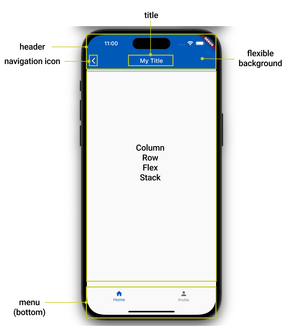
Header
The header contains the Safe Area (e.g. iPhone notch) and by default has the background color of your theme's primaryColor. It includes:
navigation icon. If a drawer menu is used the system will automatically show an icon to open/close the drawer, otherwise if this page can navigate back to the previous page, the back arrow will be shown. If neither condition is true, the icon will not be visible, in which case the title will stretch to fill the entire horizontal space.title. Its simplest form is a string which is the title text. You may override it with a custom widget.flexible background. Specifies a widget that will fill the entire header (including the notch). This is typically used as a background for the header. This widget will be laid out first, with the navigation icon and the title overlay on top.
Properties
| Property | Type | Description |
|---|---|---|
| titleText | string | The title for the screen |
| titleWidget | Widget | Render this widget as the screen title |
| styles | object | see properties |
| flexibleBackground | Widget | This widget (typically used as an background image) acts as the header's background, with the title bar and the bottom widget overlaid on top. On non-scrollable screen, its dimensions is dictated by the header's width and height. |
Header.styles
| Property | Type | Description |
|---|---|---|
| backgroundColor | Color | By default the background color uses the theme's 'primary' color. You can override the header's background color here. It can be specified as a number, a predefined color name, or a hexadecimal value starting with '0x'. transparent black blue white red grey teal amber pink purple yellow green brown cyan indigo lime orange |
| color | Color | By default the navigation icon, title, and action icons uses the theme's 'onPrimary' color. You can override their colors here. It can be specified as a number, a predefined color name, or a hexadecimal value starting with '0x'. transparent black blue white red grey teal amber pink purple yellow green brown cyan indigo lime orange |
| elevation | integer | Raise the header on its z-coordinates relative to the body. This effectively creates a drop shadow on the header's bottom edge. Minimum value: 0, Maximum value: 24 |
| shadowColor | Color | If elevation is non-zero, this will override the drop shadow color of the header's bottom edge, starting with '0xFF' for full opacity. transparent black blue white red grey teal amber pink purple yellow green brown cyan indigo lime orange |
| centerTitle | boolean | Whether to align the title in the title bar's center horizontally (default: true) |
| titleBarHeight | integer | For consistency, the header's title bar has the default fixed height of 56 regardless of its content. You may adjust its height here. Minimum value is 0 |
| flexibleMinHeight | integer | Applicable only if scrollableView is enabled. This attribute effectively sets the header's min height on scrolling (header's height will varies between the flexibleMinHeight and flexibleMaxHeight). Note that this attribute will be ignored if smaller than the titleBarHeight |
| flexibleMaxHeight | integer | Applicable only if scrollableView is enabled. This attribute effectively sets the header's max height on scrolling (header's height will varies between the flexibleMinHeight and flexibleMaxHeight). This attribute will be ignored if smaller than the flexibleMinHeight |
| animation | object | see properties |
| scrollMode | enum | Specify if header stays pinned or goes up floating, when page is scrolled up. |
Note: When the entire View is specified as scrollable, flexible background's height can vary in height (hence flexible) on scroll with a parallax effect.
Header.styles.animation
| Property | Type | Description |
|---|---|---|
| enabled | boolean | Animation behaviour true or false. |
| duration | integer | Specify time in milliseconds for which animation must play. |
| curve | string | Specify animation curve like easeIn easeOut or linear. |
| animationType | enum | Specify animation type that'll play when scrolled such as fade or drop. default value: drop. |
Menu
Ensemble provides support for five menu types that offer extensive customization options, including the ability to add custom items which are indeed custom widgets. These menu types allow users to meet their unique design needs or client requirements. Below, you will find detailed information about each menu type, including the supported properties, styles, and illustrative examples for better understanding.
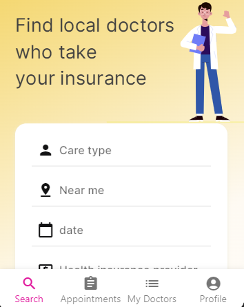
BottomNavBar
This is the navigation bar at the bottom of the screen, typical of most iOS and Android apps. Where each item has several properties as explained below.
BottomNavBar.Properties
| Property | Type | Description |
|---|---|---|
| items | array of objects | List of menu items (minimum 2). see properties |
| styles | object | see properties |
BottomNavBar.items
| Property | Type | Description |
|---|---|---|
| icon | string | Icon name from Material Icons``Font Awesome``Remix or custom font icons. |
| iconLibrary | string | Enables the usage of various icon libraries like FontAwesome, Remix, Material Icons or custom icon fonts within ensemble. |
| label | string | Defines the text displayed below the icon, providing a descriptive title or name for the menu item |
| page | string | The new page to navigate to on click |
| selected | boolean | Mark this item as selected. There should only be one selected item per page. |
| visible | boolean | Mark this item as visible. Default is true |
| floating | boolean | Mark this item as a floating icon |
| floatingMargin | integer or string | The margin around the floating. |
| floatingAlignment | string | How to align the floating in the BottomNavBar. The values are left``center``right and none |
| color | Color | Unselected icon color, starting with '0xFF' for full opacity e.g 0xFFCCCCCC. It can be specified as a number, a predefined color name, or a hexadecimal value starting with '0x'. transparent black blue white red grey teal amber pink purple yellow green brown cyan indigo lime orange |
| selectedColor | Color | Selected icon color, starting with '0xFF' for full opacity e.g 0xFFCCCCCC. It can be specified as a number, a predefined color name, or a hexadecimal value starting with '0x'. transparent black blue white red grey teal amber pink purple yellow green brown cyan indigo lime orange |
| backgroundColor | Color | Background color of the box. which can be represented in different formats. It can be specified as a number, a predefined color name, or a hexadecimal value starting with '0x'. transparent black blue white red grey teal amber pink purple yellow green brown cyan indigo lime orange |
| floatingBackgroundColor | Color | Floating item background color, starting with '0xFF' for full opacity e.g 0xFFCCCCCC. It can be specified as a number, a predefined color name, or a hexadecimal value starting with '0x'. transparent black blue white red grey teal amber pink purple yellow green brown cyan indigo lime orange |
| floatingIconColor | Color | Floating item icon color, starting with '0xFF' for full opacity e.g 0xFFCCCCCC. It can be specified as a number, a predefined color name, or a hexadecimal value starting with '0x'. transparent black blue white red grey teal amber pink purple yellow green brown cyan indigo lime orange |
| customItem | object | Allows user to use custom widgets for two states selected and UnSelected. |
BottomNavBar.items.customItem
| Property | Type | Description |
|---|---|---|
| widget | Widget | Custom bottom navigation item for the unselected state |
| selectedWidget | Widget | Custom bottom navigation item for the selected state |
BottomNavBar.styles
| Property | Type | Description |
|---|---|---|
| backgroundColor | Color | Background color of the box. which can be represented in different formats. It can be specified as a number, a predefined color name, or a hexadecimal value starting with '0x'. transparent black blue white red grey teal amber pink purple yellow green brown cyan indigo lime orange |
Example
BottomNavBar:
  styles:
    backgroundColor: white
    color: grey
    selectedColor: orange
    floatingBackgroundColor: orange
    floatingIconColor: white
  items:
    - label: Home
      activeIcon: home
      icon: home
      page: Home

    - customItem:
        widget: CustomNavBarItem
        selectedWidget: ActiveCustomNavBarItem
      page: Icon

    - icon: note_add
      floating: true
      floatingAlignment: center
      floatingMargin: 5
      onTap: |
        //@code
        ensemble.navigateScreen('Lottie');

    - icon: search
      label: Search
      page: Image
      visible: true

    - customItem:
        widget: CustomNavBarItemWithImage
        selectedWidget: ActiveCustomNavBarItemWithImage
      page: WeeklyScheduler
This sippet has example for how user can utilize
- Custom widgets as items for the menu
- Floating icons
To get hands-on experience with BottomNavBar, check the live example on Ensemble Studio (opens in a new tab).
Drawer
This menu type puts the menu behind a drawer icon on the header. The drawer icon will be positioned to the 'start' of the header (left for most languages, right for RTL languages). The drawer can be controlled programmatically using the openDrawer and closeDrawer actions.
Drawer.Properties
| Property | Type | Description |
|---|---|---|
| header | widget | Custom widget to be displayed at the top of the drawer |
| footer | widget | Custom widget to be displayed at the bottom of the drawer |
| items | array of objects | List of menu items. see properties |
| styles | object | see properties |
Drawer.items
| Property | Type | Description |
|---|---|---|
| icon | string | Icon name from Material Icons, Font Awesome, Remix or custom font icons |
| activeIcon | string | Icon to display when the item is selected. Falls back to icon if not specified |
| iconLibrary | string | Specify icon library: FontAwesome, Remix, Material Icons or custom icon fonts |
| label | string | Text displayed next to the icon |
| page | string | The page to navigate to when clicked |
| selected | boolean | Mark this item as selected. Only one item should be selected per page |
| visible | boolean | Whether the item should be shown. Default is true |
| isClickable | boolean | Whether the item can be interacted with. Useful for section headers. Default is true |
| switchScreen | boolean | Whether to navigate to the specified page when clicked. Default is true |
| onTap | action | Custom action to execute when item is tapped. Executes before page navigation if switchScreen is true |
| customItem | object | Allows using custom widgets for menu items. see properties |
Drawer.items.customItem
| Property | Type | Description |
|---|---|---|
| widget | widget | Custom drawer item for the normal state |
| selectedWidget | widget | Custom drawer item for the selected state |
Drawer.styles
| Property | Type | Description |
|---|---|---|
| backgroundColor | integer or string | Background color of the box. which can be represented in different formats. It can be specified as a number, a predefined color name, or a hexadecimal value starting with '0x'. transparent black blue white red grey teal amber pink purple yellow green brown cyan indigo lime orange |
Example
View:
  header:
    title: Drawer Example
    leadingWidget:
      Icon:
        name: menu
        onTap:
          openDrawer:
  menu:
    Drawer:
      styles:
        backgroundColor: white
      header:
        Column:
          styles:
            height: 200
            padding: 16
            backgroundColor: "#1a1f2b"
          children:
            - Text:
                text: "User Name"
                styles:
                  textStyle:
                    color: white
                    fontSize: 24
      footer:
        Column:
          styles:
            padding: 16
            backgroundColor: "#1a1f2b"
          children:
            - Text:
                text: "App Version 1.0.0"
                styles:
                  textStyle:
                    color: grey

      items:
        # Section header (non-clickable)
        - label: "Main Menu"
          isClickable: false

        # Regular menu item
        - label: "Home"
          icon: home
          page: home

        # Custom menu item
        - customItem:
            widget: CustomDrawerItem
          page: settings

        # Item with custom action
        - label: "Share App"
          icon: share
          switchScreen: false
          onTap:
            closeDrawer:
You can program either drawer using these actions:
openDrawer: Opens the drawer programmaticallycloseDrawer: Closes the currently open drawer
The drawer can be opened/closed from any widget's onTap or other action handlers:
Button:
  label: Open Menu
  onTap:
    openDrawer:
Note: Only one drawer (either Drawer or EndDrawer) can be open at a time. If both drawer types are configured, the app-level drawer takes precedence over screen-level drawers.
Output
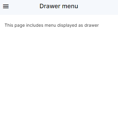
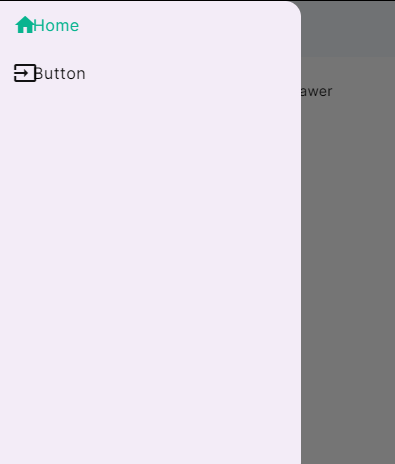
To get hands-on experience with Drawer, check the live example on Ensemble Studio (opens in a new tab)
End Drawer
Similar to Drawer but the drawer icon will be positioned to the 'end' of the header (right for most languages, left for RTL languages). You can check its properties here.
To get hands-on experience with End Drawer, check the live example on Ensemble Studio (opens in a new tab)
SideBar
A fixed navigation menu to the 'start' of the screen (left for most languages, right for RTL languages). The menu may become a drawer menu on lower resolution or screen sizes.
Sidebar.Properties
| Property | Type | Description |
|---|---|---|
| header | widget | The header widget for the menu |
| footer | widget | The footer widget for the menu |
| items | array of objects | List of menu items (minimum 2). see properties |
| styles | object | see properties |
Sidebar.items
| Property | Type | Description |
|---|---|---|
| icon | string | Icon name from Material Icons``Font Awesome``Remix or custom font icons. |
| iconLibrary | string | Enables the usage of various icon libraries like FontAwesome, Remix, Material Icons or custom icon fonts within ensemble. |
| label | string | Defines the text displayed below the icon, providing a descriptive title or name for the menu item |
| page | string | The new page to navigate to on click |
| selected | boolean | Mark this item as selected. There should only be one selected item per page. |
| visible | boolean | Mark this item as visible. Default is true |
Sidebar.styles
| Property | Type | Description |
|---|---|---|
| backgroundColor | integer or string | Background color of the box. which can be represented in different formats. It can be specified as a number, a predefined color name, or a hexadecimal value starting with '0x'. transparent black blue white red grey teal amber pink purple yellow green brown cyan indigo lime orange |
| borderWidth | integer | The thickness of the border |
| borderColor | integer or string | Color of the border, which can be represented in different formats. It can be specified as a number, a predefined color name, or a hexadecimal value starting with '0x'. transparent black blue white red grey teal amber pink purple yellow green brown cyan indigo lime orange |
| itemDisplay | string | How to render each navigation item. stacked sideBySide |
| itemPadding | integer or string | Padding for each navigation item with CSS-style value |
| minWidth | integer | The minimum width for the menu (default 200) |
Example
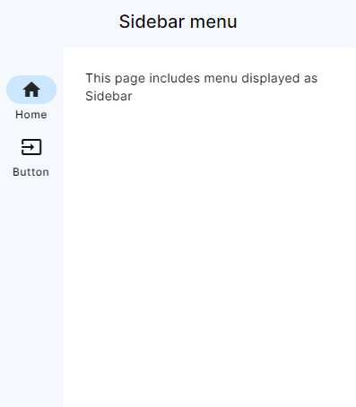
An example on how to use Sidebar menu.
View:
  title: Sidebar menu
  menu:
    Sidebar:
      items:
        - label: Home
          icon: home
          page: Home
        - label: Button
          icon: input
          page: Button

  Column:
    styles: { gap: 16, padding: 24, scrollable: true }
    children:
      - Markdown:
          text: |
            This page includes menu displayed as Sidebar
Output
To get hands-on experience with Sidebar, check the live example on Ensemble Studio (opens in a new tab)
Body
The View requires a single widget defined as its child. This will act as the body content, and can only be a Column, Row, Flex, or Stack widget.
API
API provides a convenient way to interact with external services or data sources, allowing developers to make HTTP requests, access data, and integrate various functionalities into their applications.
Properties
| Property | Type | Description |
|---|---|---|
| method | String | The HTTP method of the request, such as GET, POST, DELETE, PUT, PATCH |
| uri | String | The URI for the request |
| body | Object | The request body |
| headers | Object | The headers for the request |
| onResponse | Action | The action to handle the response |
| onError | Action | The action to handle errors |
| inputs | Array | The input values |
To learn about API's in detail, click here
Global
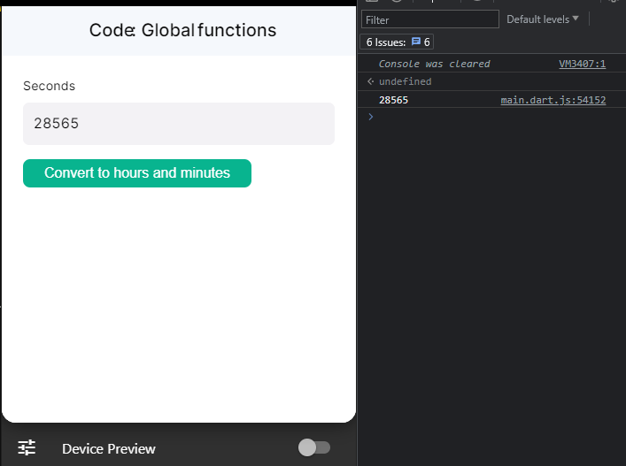
Global enables users to declare or define functions and variables which can be accessed globally inside the whole screen in every widget. In simple words its scope ig global just like a normal JavaScript Global Execution Context where users can access these functions anywhere in the screen.
Example
View:
  header:
    title: "Code: Global functions"
  styles:
    scrollableView: true
  Column:
    styles: { gap: 16, padding: 24 }
    children:
      - TextInput:
          id: secondsInput
          label: Seconds
          value: 28565
      - Button:
          label: Convert to hours and minutes
          onTap:
            executeCode:
              body: |-
                //@code
                results.text = convertSecondsToHours(secondsInput.value);

      - Text:
          id: results

Global: |-

  function convertSecondsToHours (s) {

    console.log(s);
  }
Output
The output can be checked in the logs for browser
Putting it together
This example illustrates almost all the widgets which are integral part of ensemble page structure. It also demonstrates a comprehensive usage of BottomNavBar, onLoad action, API calls and custom widgets.
View:
  onLoad:
      invokeAPI:
        name: getUser
        inputs:
          id: 32GelurbLbd6umj3ULOkAXYSYyq2

  # Set the view to be scrollable
  styles:
    scrollableView: true
menu:
    BottomNavBar:
      styles:
        shadowColor: 0xFFFD451C
      items:
        - icon: home
          label: Home
          page: Home
          selected: true
        - label: Favorite
          icon: favorite
          page: Favorite
        - label: Promos
          icon: loyalty
          page: Promos
        - label: Account
          icon: account_circle
          page: Profile

  # This is the parent widget for all screen content
  body:
    Column:
      styles:
        backgroundGradient:
          colors: [ 0xFFF4D66C, 0xFFFEFAF3, 0xFFFFFFFF ]
          start: topLeft
          end: bottomRight

      children:
        - UserInfo
        - SearchBar
        - Categories
        - NearbyFood
Output
To get hands-on experience with a complete Application, check Ensemble Studio (opens in a new tab)