Composite Widgets
Composite widgets are a powerful concept in Ensemble where multiple smaller widgets are combined to create a more complex and reusable widget.
Composite widgets can be composed of any combination of basic UI elements such as buttons, text fields, labels, etc., allowing app developers to create complex UI components without having to recreate the same layout and functionality multiple times.
Benefits of Composite Widgets
- Reusability: Composite widgets can be reused across different parts of an app or even across multiple apps, reducing duplication of code and effort.
- Modularity: By breaking down UI components into smaller widgets, developers can build more modular and maintainable app definitions.
- Customization: Composite widgets allow for easy customization through inputs, enabling app developers to adapt the widget's behavior and appearance to suit different use cases.
How to use them
When using a composite widget,
- prefix the widget name with
ensemble - pass required inputs
- further customize the widget with optional parameters
View:
  body:
    Column:
      children:
        - ensemble.RatingStars:
            inputs:
              rating: 3
              size: 24
              starColor: white
              starBackgroundColor: red
              starGaps: 8
              starPadding: 8
              starBorderRadius: 40
Directory of composite widgets
| Name | Kitchen sink example | Output |
|---|---|---|
| HorizontalProgressBar | link (opens in a new tab) |  |
| ImageThumbnailCarousel | link (opens in a new tab) |  |
| ProfileImageWithIndicator | link (opens in a new tab) |  |
| RatingStars | link (opens in a new tab) |  |
Contributing to Composite Widgets
Contributions from the community can greatly enhance the functionality and versatility of composite widgets. Here's how you can contribute:
1. Create your widget
Create an app and follow these guidelines to create your proposed composite widget.
-
In Studio, navigate to widgets tab of your app and create a new widget.
-
Your widget should take inputs allowing app developers to customize the widget. Required inputs should be kept to items that without them, the widget cannot be rendered. Styling of the widget should be configurable by using optional inputs. For instance, background of a Column can be made optional.
Widget: inputs: - bgColor # this is optional and defaults to white body: Column: styles: backgroundColor: '${ bgColor ? bgColor : "white" }' -
Avoid setting width and height specially on container widgets such as rows and columns.
-
Your widget should be self contained and not rely on definitions outside the widget such as API definitions and storage.
2. Create a screen documenting the widget
Within the same app, create a screen to outline inputs and several example usages. See this example (opens in a new tab) for reference.
3. Share your widget on Builder Support
Join Ensemble Discord server (opens in a new tab), and post a new topic in Builder Support channel (opens in a new tab) with a link to your app.
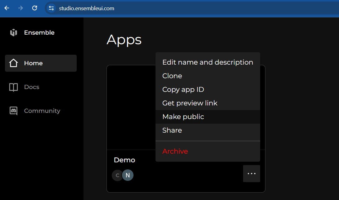
Make sure to make your app public so that reviewers can access it.
