Map widget
The Map widget enables the display of location markers and overlays, providing a dynamic visual representation of geographic data.
Test in Kitchen Sink (opens in a new tab)
Basic Usage
Map requires a dimension to render. Most parent widget will provide a constraint so Map can stretch to fit. When the parent doesn't provide a size, e.g. Column on the vertical axis, you must provide the dimension on that axis. Below we use a FlexColumn which will consume all available vertical space, and in turn gives Map the complete screen height.
View:
  onLoad:
    invokeAPI:
      name: getVenue

  body:
    FlexColumn:
      children:
        - Map:
            styles:
              # zoom to fit all markers
              autoZoom: true
              # position the toolbar
              toolbarAlignment: centerLeft
            markers:
              data: ${getVenue.body.location}
              name: location
              location: ${location.lat} ${location.lng}

API:
  getVenue:
    uri: https://dummyjson.com/users/1
    method: GET
    onResponse: |-
      // modifying the response to add latitute and longitude
      response.body = {
        "location": [{
          "lat": 37.82159,
          "lng": -121.99996
        }]
      };
Using custom markers
Ensemble provides three different ways of customizing markers. You can use any Ensemble icons, use images via URLs or local asset, or define a custom widget to render as a marker.
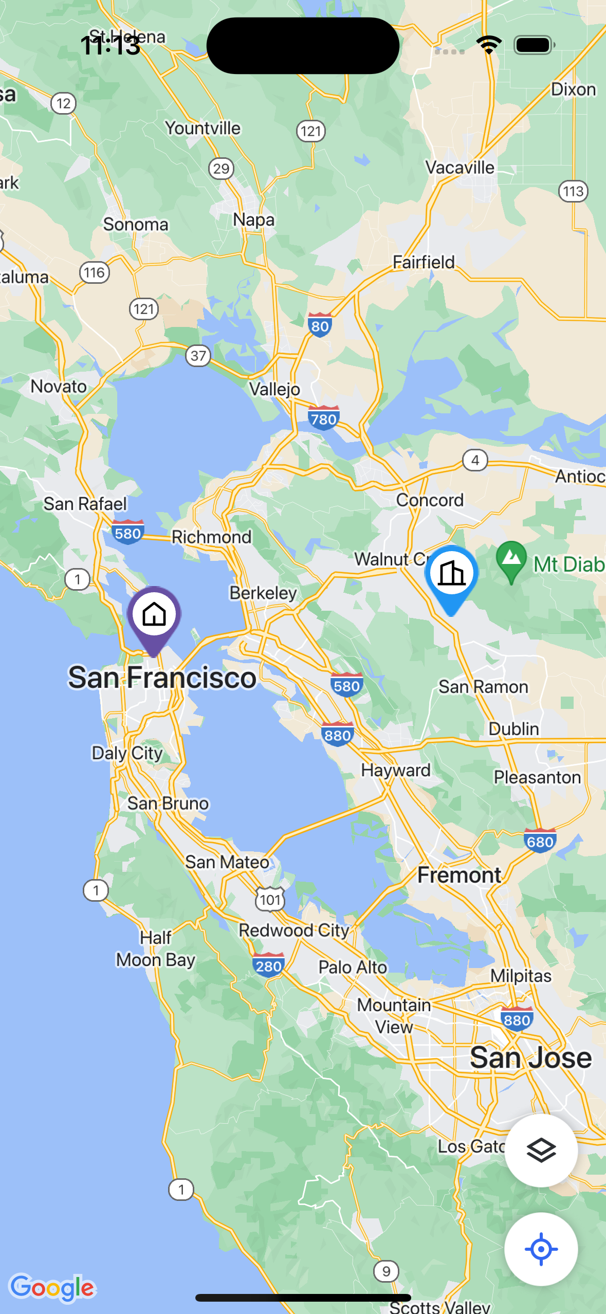
Using Ensemble icons (Native only)
Ensemble provides Material, FontAwesome, and Remix icons out of the box, and you can use these icons as markers. This is supported on Native platform only (Web is not currently supported).
The marker's size can be adjusted using the combination of icon's size, iconPadding (the circular shape around the icon), and padding (the space between the inner circular shape and the pin itself).
View:
  onLoad:
    invokeAPI:
      name: getVenue

  body:
    Map:
      styles:
        autoZoom: true
        autoZoomPadding: 100
      markers:
        data: ${getVenue.body.location}
        name: location
        location: ${location.lat} ${location.lng}
        marker:
          icon:
            name: home_5_line
            library: remix
        selectedMarker:
          icon:
            name: building_2_line
            library: remix
            backgroundColor: blue


API:
  getVenue:
    uri: https://dummyjson.com/users/1
    method: GET
    onResponse: |-

      response.body = {
        "location": [{
          "lat": 37.82159,
          "lng": -121.99996
        }, {
          "lat": 37.773972,
          "lng": -122.431297
        }]
      };
Using Images
You can use images as markers by providing a URL or local asset. To further fine-tune the marker dimension, use resizedWidth or resizedHeight, but avoid using both to maintain the aspect ratio.
Map:
  styles:
    autoZoom: true
    autoZoomPadding: 100
  markers:
    data: ${getVenue.body.location}
    name: location
    location: ${location.lat} ${location.lng}
    marker:
      image:
        source: <URL or local asset>
        resizedWidth: 40
Using custom widget (Native only)
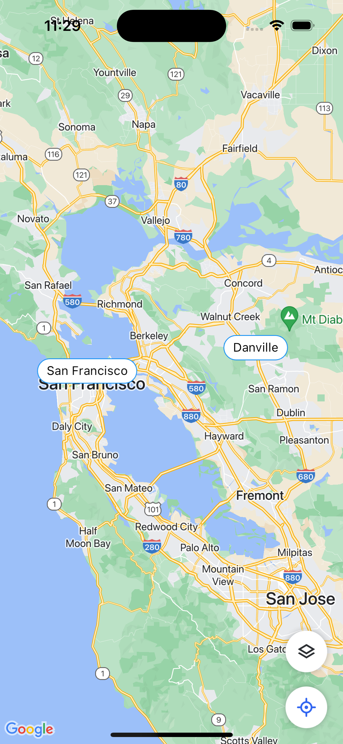
You can use a custom widget to render as a marker. This will only supported on Native platform.
View:
  onLoad:
    invokeAPI:
      name: getVenue

  body:
    Map:
      styles:
        autoZoom: true
        autoZoomPadding: 100
      markers:
        data: ${getVenue.body.items}
        name: item
        location: ${item.lat} ${item.lng}
        marker:
          widget:
            Text:
              text: ${item.city}
              styles:
                padding: 5 10
                borderColor: blue
                backgroundColor: white
                borderRadius: 100
                textStyle:
                  color: black


API:
  getVenue:
    uri: https://dummyjson.com/users/1
    method: GET
    onResponse: |-

      response.body = {
        "items": [{
          "lat": 37.82159,
          "lng": -121.99996,
          "city": "Danville"
        }, {
          "lat": 37.773972,
          "lng": -122.431297,
          "city": "San Francisco"

        }]
      };
Properties
| Property | Type | Description |
|---|---|---|
| fixedMarker | boolean | Keeps the marker fixed at the center of the map while allowing users to move the map around it. This is useful for selecting a location on the map and get the precise coordinates when users move the map around. |
| draggableMarker | boolean | Allows users to drag the marker around the map. |
| styles | object | See properties |
| onCameraMove | action | Execute an Action when the map's bound has changed. The bound data is available using event.data.bounds.<southwest/northeast>.<lat/lng>. |
| onMapCreated | action | Execute an Action when the map's initial state has been rendered. Note that this may not mean the location and markers (if any) are available yet. |
| markers | object | See properties |
styles
| Property | Type | Description |
|---|---|---|
| expanded | boolean | If the parent is a Row or Column, this flag will stretch this widget in the appropriate direction. (e.g stretch horizontally for parent of type Row) |
| markerWidth | integer | The width of each marker. (default 60) |
| markerHeight | integer | The height of each marker. (default 30) |
| elevation | integer | The z-coordinate at which to place this material relative to its parent. A non-zero value will show a shadow, with its size relative to the elevation value. Minimum value: 0, Maximum value: 24 |
| elevationShadowColor | integer or string | The shadow color for the elevation, which can be represented in different formats. It can be specified as a number, a predefined color name, or a hexadecimal value starting with '0x'. transparent black blue white red grey teal amber pink purple yellow green brown cyan indigo lime orange |
| elevationBorderRadius | string or integer | The border radius of the widget.This can be specified using CSS-like notation with 1 to 4 integers. Minimum value: 0. |
| alignment | string | The alignment of the widget relative to its parent. topLeft, topCenter, topRight, centerLeft, center, centerRight, bottomLeft, bottomCenter, bottomRight. |
| stackPositionTop | integer | The distance of the child's top edge from the top of the stack. This is applicable only for Stack's children. |
| stackPositionBottom | integer | The distance that the child's bottom edge from the bottom of the stack. This is applicable only for Stack's children. |
| stackPositionLeft | integer | The distance that the child's left edge from the left of the stack. This is applicable only for Stack's children. |
| stackPositionRight | integer | The distance that the child's right edge from the right of the stack. This is applicable only for Stack's children. |
| visibilityTransitionDuration | integer | Specify the duration in seconds when a widget animates between visible and not visible state. Note that setting this value will cause the widget to still occupy the UI space even when it is not visible. |
| visible | boolean | Toggle a widget visibility on/off. Note that an invisible widget will not occupy UI space, unless the visibilityTransitionDuration is specified. |
| opacity | double | Adjusts the opacity of the widget. Values range from 0 (fully transparent) to 1 (opaque). Default is 1. |
| captureWebPointer | boolean | Applicable for Web only. When overlaying widgets on top of certain HTML container (e.g. Maps), the mouse click is captured by the HTML container, causing issue interacting with the widget. Use this to capture and maintain the mouse pointer on your widget. |
| width | integer | The width property determines the horizontal size of an element, allowing control over its width dimension within the layout. |
| height | integer | The height property determines the vertical size of an element, allowing control over its height dimension within the layout. |
| autoZoom | boolean | Automatically zoom the maps to show all the markers (and optionally the current location). Default True. |
| autoZoomPadding | integer | Adjusts the padding around map elements automatically, ensuring a visually balanced and optimized display within the Maps widget. |
| locationEnabled | boolean | Enables the use of location services, allowing the Maps widget to access and display the user's current location on the map. |
| includeCurrentLocationInAutoZoom | boolean | Adjusts the automatic zoom level of the map to include the user's current location within the visible area of the Maps widget. |
| showToolbar | boolean | Show the Map toolbar that contains some convenience controls. You can also turn each individual controls on or off. |
| showMapTypesButton | boolean | Toggle between the different map types. (default true) |
| showLocationButton | boolean | Show the button that animates to the user's location. (default true) |
| showZoomButtons | boolean | Applicable on Web only. Show the zoom in/out controls on the map. (default true on Web) |
| rotateEnabled | boolean | Enables the ability to rotate the map view within the Maps widget, allowing users to change the orientation for a customized viewing experience. |
| scrollEnabled | boolean | Allows users to scroll and pan the map within the Maps widget, providing interactive navigation and exploration of the map content. |
| tiltEnabled | boolean | Enables users to adjust the tilt or perspective of the map view for a dynamic and immersive experience. |
| zoomEnabled | boolean | Enables users to zoom in and out on the map within the Maps widget for closer or wider views. |
| toolbarMargin | integer/ string | The margin around the toolbar. (default 10 on all sides) |
| toolbarAlignment | string | How to align the toolbar within the map. (default bottom right). If both positioning (top/bottom/left/right) and alignment are used, positions will be applied first, then alignment within the available constraint. topLeft, topCenter, topRight, centerLeft, center, centerRight, bottomLeft, bottomCenter, bottomRight. |
| toolbarTop | integer | Offset the toolbar from the top edge of the map |
| toolbarBottom | integer | Offset the toolbar from the bottom edge of the map |
| toolbarLeft | integer | Offset the toolbar from the left edge of the map |
| toolbarRight | integer | Offset the toolbar from the right edge of the map |
| mapType | String | Allows users to select different map types normal, satellite, terrain, hybrid |
| initialCameraPosition | Object | Represents the initial camera position on the map. see properties |
| markerOverlayMaxWidth | Integer | Specifies the maximum width of the marker overlay |
| markerOverlayMaxHeight | Integer | Sets the maximum height of the marker overlay |
| scrollableMarkerOverlay | Boolean | Determines if swiping left/right within the overlay will navigate to next/previous marker |
| dismissibleMarkerOverlay | Boolean | Enables swiping down to close the overlay |
| autoSelect | Boolean | Automatically selects a marker when the markers are updated |
markers
| Property | Type | Description |
|---|---|---|
| data | String | Binds the marker list to the data |
| name | String | Gives a name to the marker |
| location | object | Specifies the geographic coordinates (latitude and longitude) for the Maps widget to display a specific location. see properties |
| lat | Number | Latitude coordinate of the marker |
| lng | Number | Longitude coordinate of the marker |
| marker | object | see properties |
| source | string | The marker's image asset (URL or local asset) |
| selectedMarker | object | see properties |
| source | string | The marker's image asset when selected (URL or local asset) |
| overlayWidget | Widget | The widget to render as an overlay over the maps. Use this to convey more detail info for each marker. |
| onMarkerTap | action | Action to execute when tapping on the marker |
| onMarkersUpdated | action | Action to execute when the markers have been updated and rendered |
markers.location
| Property | Type | Description |
|---|---|---|
| lat | Number | The latitude of the marker |
| lng | Number | The longitude of the marker |
markers.marker
| Property | Type | Description |
|---|---|---|
| source | string | The marker's image asset. This can come from URL or from local asset. |
markers.selectedMarker
| Property | Type | Description |
|---|---|---|
| source | string | The marker's image asset when selected. This can come from URL or from local asset. |
styles.initialCameraPosition
| Property | Type | Description |
|---|---|---|
| lat | Number | Latitude coordinate |
| lng | Number | Longitude coordinate |
| zoom | Integer | Zoom level |