Using BottomSafeArea for Responsive Layouts
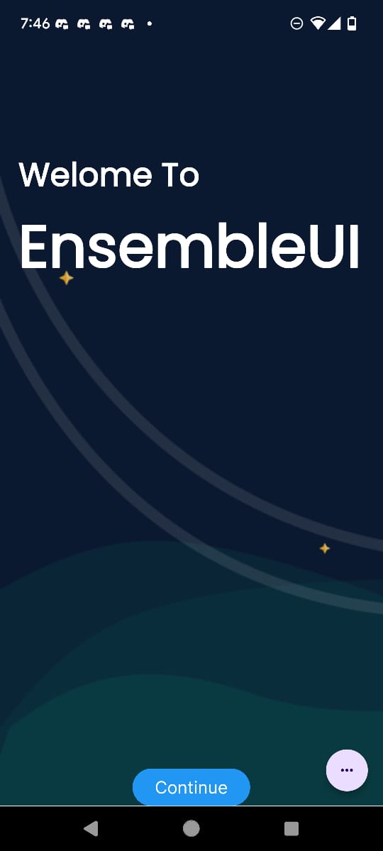
In mobile devices, especially those with a 3-button navigation bar (as seen on some Android devices), extra space at the bottom can affect the layout of your UI elements. To ensure that your content doesn't get overlapped by the navigation bar, it’s important to adjust the height of your widgets to exclude the space taken by the navigation bar, known as the "Safe Area."
EnsembleUI provides access to the device’s dimensions, including the height and the bottom safe area, allowing you to adjust your UI accordingly. By subtracting the bottom safe area from the total height, your layout dynamically adjusts, ensuring nothing overlaps with the navigation bar. Here's an example:
FlexColumn:
  styles:
    height: ${ device.height - device.safeAreaBottom }
Visual Example:
Here are two screenshots that show the UI with and without the 3-button navigation bar, demonstrating how the layout adjusts dynamically.

|

|
By implementing this trick, you ensure that your app’s UI remains consistent and user-friendly across devices with different navigation styles. This technique prevents layout issues such as buttons being hidden or content being overlapped.